
I have been designing solution architectures and mentoring others on better solution architecture diagrams for decades and have long held my "diagram first" mantra, so at this point, I have seen many excellent solution architecture diagrams. I have also seen many not-so-impressive solution architecture diagrams. I have strong opinions about what diagram notations are best for solution architecture. I will restrain those opinions for this article and instead provide some tips that will help you regardless of your preferred approach.

You should start every diagram with the simplest of things: a title. The title is more important than you might think: adding the title first establishes the scope of your diagram. How can you create a clear diagram if you are unclear what you are diagramming? The first step to better solution architecture diagrams is being clear about what you are diagramming.
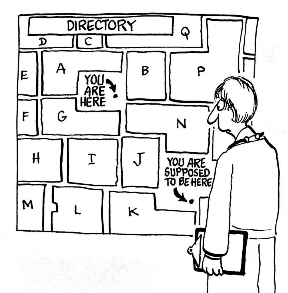
The title is the airport map "you are here" of your diagram. It helps both you and the viewer get your bearings before you dive in.
I expand "title" to include some foundational information about the diagram.
The title is critical for two primary reasons:
I know. "Use the right diagram" seems like a ridiculous thing to say, but it isn't! Different diagramming notations are better suited for specific types of communication. Some diagram formats more clearly depict flows. Some are best for static connectivity. Others are prettier for Powerpoint usage, but trade-off some accuracy for the good looks (I am looking at you, Conceptual Solution Architecture Diagram).

Picking the best diagram format for the information you want to communicate makes a huge difference. Sometimes, when I struggle to depict some aspect of a solution architecture quickly but feel like I am banging my head against the wall, I realize that I am using the wrong diagram. It is easier to create a better solution architecture diagram if you are working with the right notation; it's like banging a nail in with a hammer vs. a screwdriver.
While creating more diagrams may seem counter-intuitive, having multiple diagrams, each the "right diagram" to communicate a particular aspect of the solution architecture is simpler and more accessible for your audience. Even when that means they need to look at multiple views. At Wittij Consulting, we have a standard set of solution architecture diagrams we produce for any architecture we are working on:
Each is focused on a different aspect of the architecture. The tip to not overload applies to diagram scoping as well. Sometimes two information flow diagrams are more understandable because there are so many boxes and lines a single diagram starts to get confusing.
Both you and your audience benefit when you select a standard set of notations for solution architecture diagrams.
You benefit because once you master a diagramming notation, you don't spend time thinking about the notation and instead can focus on the architecture you are trying to depict. It is like fluency in a language: before you achieve fluency, substantial effort goes into determining the correct word to communicate a thought. The more fluent you are, the less that is an issue. You can more quickly and correctly communicate what you are thinking to someone else.

The same is true for your audience. If you were trying to explain your architecture in german, but your audience did not speak the german language, it would be much slower (and more frustrating for them) for you to teach them german so before they could understand what you were trying to explain. With diagramming it is the same, any energy your audience spends trying to understand your diagram distracts from them understanding your solution architecture.
Suppose every time your audience sees an architecture diagram it looks similar to the prior. In that case, they learn the notation then parsing it becomes intuitive, so they can instead focus on the architecture being presented.
Anything on a solution architecture diagram that does not make your solution architecture clearer becomes the noise that makes it more difficult for your viewer to understand the solution architecture.
I am an advocate of adopting an industry-standard notation. When you do, you benefit from pre-existing knowledge, tools, and skilled people. Not to mention the "trial and error" that has already gone into refining the notation. Clearly it is easier to create better solution architecture diagrams when working with a notation that was designed specifically for that! We primarily use UML.
But even if you prefer to select something else or even bake your own approach, it behooves you to pick anything instead of winging it every time you create a diagram.

Anything on a solution architecture diagram that does not make your solution architecture clearer becomes the noise that makes it harder for your viewer to understand the architecture. That is why less is always more. A clear architecture diagram is as much about what you leave off it as what you include on it.
When you are done with your solution architecture diagram, I recommend that you review it and see what could you delete from the page without losing important information about the solution architecture. Trust me, you will find something. If your diagram is not left with a healthy amount of whitespace, you need to either keep deleting or follow the aforementioned advice to create multiple fit-for-purpose diagrams.

I have a lot more to say about creating better solution architecture diagrams, but those are all the tips for today! Solution architecture is primarily a facilitation activity, so being able to clearly communicate your design is an essential skill. It is a blend of art and science. Studying tools and techniques can get you part of the way there and lots of practice will get you the rest of the way. If you are on that journey, check out our other articles on diagramming.
